I blogged a while back about We Feel Fine, a visualization of data from the internet cloud mapped to feelings by Jonathan Harris.
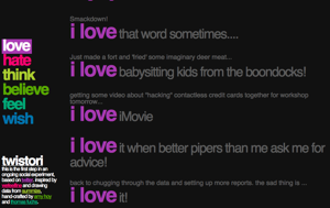
Now Thomas Fuchs and Amy Hoy have brought a similar visualization approach to Twitter with Twistori (click for full sized image):
It’s wonderful – simple, clear, lightweight, easy to watch, and elegant. I’d love it if it were possible to create your own twistori terms – maybe they’ll release the code?
Read more about it on Amy’s Blog: love & hate: from knuckle tattoos to the internet’s emotional pulse with Twistori
