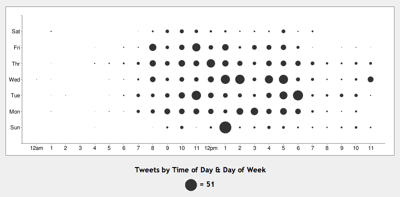
Xefer has created an intriguing mashup using data from the Twitter API, a Yahoo! Pipe to some basic transformation, and the Google Chart API to display results:
To get your own, just replace
The most interesting aspect of this project is that, other than the static files being served up by xefer.com itself, no other server-side processing is being done here; all the processing is being handled by Yahoo Pipes and Google, and of course Twitter itself which is ultimately hosting the raw data.
Who knew I tweeted so much on Sundays?
Note that the data seems to be, as per the comment on the blog post, in GMT, so you’ll need to do offsets in your head for your local timezone.

hey guys Twitter charts are great,But i have an awesome way to represent them just follow the link visifire Bubble Chart’s an amazing charting component powered by silverlight offered under upon source just for free