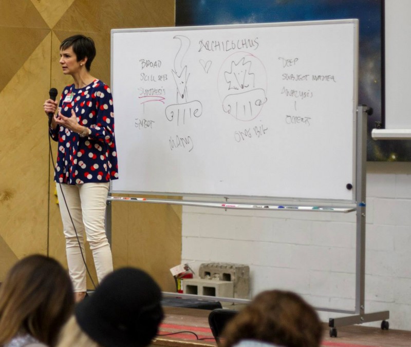
Just before the holidays, I saw Tamsen Webster (@tamadear) speak at Creative Mornings Boston on the theme of Education. She anchored the discussion on the distinction between the fox and the hedgehog. (That’s the fox on the left on the whiteboard, with the hedgehog on the right: Photo by Alyssa Alarcon from Brooklyn Boulders Somerville Facebook page).
If you’ve not encountered the fox and the hedgehog (via Jim Collins, via Nate Silver, or elsewhere), it’s a distinction made famous by Isiah Berlin’s 1953 book on Tolstoy, taking off from a fragment of Archilochus:
the fox knows many things, but the hedgehog knows one big thing
Berlin uses this notion to divide historic writers and thinkers into two camps: those who focus on going deep in analysis of one area of expertise versus those who synthesize and compare across many areas, disciplines, and approaches.
It struck me that this pair of characterizations worked well to describe a recent BostonJS meetup, which featured Mat Marquis (@wilto) (hedgehog) and Ethan Marcotte (@beep) (fox).
Mat dove deep into the past, present, and future of responsive images.
(This video is not from BostonJS, but looks to be quite similar.)
Mat’s singular focus, in identifying the problem of responsive images (the lack of a clear, standards based way to send only the correct image size and pixel density for a responsive design), collaborating with others on solutions to the problem, and getting those solutions actually adopted as part of a W3C standard, is amazing and inspiring.
Web design and development is still an industry in which a set of designers/developers concerned about the real world impact and global accessibility of the web can get involved and actually change the rules on the field of play. Check out the Responsive Images Community Group for more.
Ethan’s talk was focused more broadly on what he called “Laziness in the Time of Responsive Design.”
This video’s also not from BostonJS, but it is a very similar (slightly earlier) version of the talk from that night, with many of the same examples.
Ethan started with the story of the Pando forest in Utah, which isn’t so much a forest as a tree: one “clonal colony” covering 140 acres. Besides being the world’s oldest living organism and the world’s heaviest living organism, it’s also a great metaphor for the difficulties front-end developers and designers face in trying to keep in mind both the forest and the trees of responsive design and development.
Ethan basically argued that sometimes the best path to achieving responsiveness is letting go: leveraging simple structures of HTML and CSS, in support of design systems, in place of complex grid frameworks and javascript interactions. Of course what Ethan calls “laziness” I’d call clever restraint. It does, in the end, require less code – and in the end the code is specifying less in order to achieve the desired result – but that’s hardly laziness. You’ve got to have a really solid understanding of the underlying behaviors of HTML/CSS before you can even begin to think about design systems.
In the end, the point isn’t to focus on whether any individual is a hedgehog or a fox, but to recognize the value (and necessity) of both ways of thinking.
We need folks like Mat Marquis pushing hard over months and even years to get the standards and specifications in the right place, just as we need people like Ethan Marcotte reminding us to not lose sight of the overall goal and the philosophy behind the page design, drawing on broader disciplines and histories of architecture and design.
In my own career, I’ve certainly played more fox than hedgehog, jumping from Academia (and an interdisciplinary PhD that never could quite settle on a single genre/medium/discipline) to web development, and within web development having been a front-end developer, user experience designer, project manager, technical architect, managing director, and CEO. But it’s only when I narrowed my focus – first to the open source CMS space and most recently to WordPress – that I really found the value of knowing one thing well.
Responsive web design one of the toughest task and you should plan before you build the webpage, the responsive classes should be meaningful and it must contain and manage all the sections of the webpage neatly